Your CRM system has collected data on each of your sales transactions – who the purchaser is, where they are from, what they bought, where they bought it, and half a million other data points. You’ve cleaned and prepped that data, and you’re finally ready to buckle down for countless hours with Tableau or Excel or some other Visual Analytics tool, painstakingly executing the tedious but necessary work of finding the meaningful patterns in your data.
You have to. Before you finally can answer the Why – the model-building predictive analytics that you really want your data scientists doing – you need to know the What. These are the descriptive analytics: what are the most impactful trends in our data, and where are they?
You’ve been told you need shinier, fancier visualization tools to help find these trends – that faster and more vibrant charting will make these trends pop before your analysts’ eyes, so that they can get through this phase a few hours faster and slightly less exhausted.
Countless hours of analyst time spent searching for needles in haystacks.
Of course, that’s the way it has to be done. Unavoidable.
Look around you. Facebook can spot your face in the background of a family photo. Amazon can identify your voice over the kitchen fan and your kids’ cartoons. And Google has cars that can drive you from here to Topeka without a steering wheel.
Yet we still have to spot these trends ourselves?
Well, not anymore. Enter FactorPrism.
FactorPrism is revolutionary data discovery software that automatically uncovers the most meaningful patterns from your sales data, no matter how buried or convoluted. It teases out factors you wouldn’t be able to find no matter how much time you spent looking. With FactorPrism, accurately identifying the customer and product segments that have the most meaningful performance impacts is as easy as clicking a button.
Want to learn more? Watch our demo video and download a free trial license of our software above.
The first thing we ask folks when we are talking to them about automated data mining with FactorPrism is, “How do you do this today?”. That is, if we were to give you a sales dataset with weekly data by product, geography, and customer type, for example, how would you go about finding meaningful patterns in that data? Would you use Tableau, PivotTables/Charts, or some sort of other data visualization tool like Looker? What is your workflow for identifying those patterns? And, perhaps most importantly, how accurate is this process?
We claim that FactorPrism is far and away the fastest and most accurate way to tease out meaningful patterns in transactional data. Today, we are putting our money where our collective mouth is and introducing The FactorPrism Challenge.
Quite simply, our challenge to you, the data scientist, is this: Download the below CSV file containing a sample 300k rolled up sales transactions (from a de-identified data source). Use your current techniques for finding out what the major performance patterns are in this data set, and data level they reside at (geographical, product, etc).
Then, sign up for a free trial of FactorPrism, run through FactorPrism (takes about 2 minutes to set up, 5-7 minutes to run), and compare the results.
We guarantee the results you find with FactorPrism are deeper, more accurate, and more well defined. And, not to mention, much easier to produce!
Now imagine this challenge but on 300M records instead. You tell us, would your rather do it your way, or the FactorPrism way?
Happy Factoring!
As you may be aware, NYC has a vast trove of free data available through its NYC Open Data initiative (https://opendata.cityofnewyork.us/ ). We thought it would be fun to see what FactorPrism could do with some of its data, so we decided to do some digging.
It turns out one of the biggest (by records) and most popular data sets is the transactional records for the 311 database, as found here:
https://nycopendata.socrata.com/Social-Services/311-Service-Requests-from-2010-to-Present/erm2-nwe9
This dataset lists every 311 call made to the city between 2010 and today. Over 50 million records! Clearly lots of insights to be found, if only we had the time!
Well, thanks to FactorPrism, getting some very interesting results from the data took no longer than a lunch break.
Before we get into the really-not-that-nitty-gritty details bout how we used FactorPrism to get deep insights into this data quickly in the next two posts, first we thought we’d show you our interesting findings.
As we will describe later, we chose the time period 9/2013 to 3/2017 to investigate, as, by looking at the overall data, there was a clear trend upwards during that time (note, the apparent recent decline is probably due to incomplete data, so we disregarded it for now):

Our question was whether this trend was just an overall increase in usage in the service, or whether it was indicative of growth in just a smaller segment.
In a nice result for the city, it seems that overall usage is increasing 11%. This manifests itself as an 11% increase in our “OVERALL” factor, which happened to be our most impactful factor:
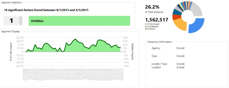
We see some seasonality in the data here – looks as if calls tend to peak in the summer. Also, we can see that 2015 seems to have a moderately higher peak than 2016.
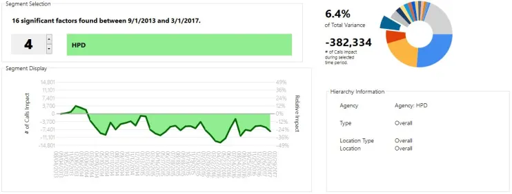
Looking through our segments a bit, we see some other surprising results. For example, our 4th biggest factor, HPD (Housing Preservation and Development), shows an overall decline of around 25% over the period. Note this factor would have been much harder to identify if the overall upward effect had not already been teased out!
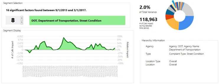
Other sub-segments show interesting patterns. For example, unsurprisingly, Street Condition complaints spike towards the summer, but were much higher in 2015 than in surrounding years.
However, on top of the overall Street Condition factor, we see a particular spike in potholes, which was actually biggest in 2014:
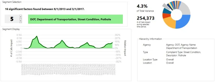
This is the kind of thing that would have gone overlooked had you just looked at the data for potholes, where the spikes were roughly level for 2014 and 2015. FactorPrism teases out that the spike in 2014 was more isolated to potholes, whereas 2015 was an overall trend in Street Condition complaints.
The last interesting factor we will mention is the seasonality in water system complaints.
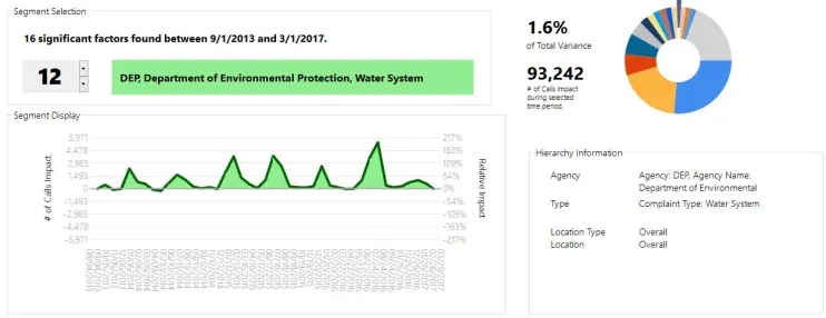
Clearly, these tend to spike sharply in July and December. However, while we saw a very sharp spike in the summer of 2016, the surge in calls in the winter was much less intense last year.
In summary, we see an overall growth trend in the usage of the 311 data system. When controlling for that trend, we see a reduction in the number of HPD calls, and significant seasonality in street condition and water system complaints.
Not bad for an hour’s worth of work! (well, mostly it was the computer working). For more on that, see the next post in our series.
Now that you see what we can do looking at 50 million calls of a city with 8 million customers, imagine what we can do for your business!
Until next time, Happy Factoring!
In our previous post, we described the results of our investigation into the NYC 311 dataset using FactorPrism. In this post, we’ll dive a little more into how we attained that data and prepared it for analysis. While some of this post’s content is probably only relevant for this particular dataset, it is still interesting even in that limited case, and most of what we do here is generally applicable. In this way, this can serve as a tutorial for how you would set up your own dataset.
The unprocessed 311 data can be found at the Socrata server here. However, this data is just the raw transactions. While FactorPrism can handle this level of data, it is going to run faster (and be a smaller file), if we trim some columns and aggregate it to a less granular time period first. We could do this outside of Socrata, of course, using a simple GROUP BY query in SQL, but Socrata nicely lets us do this on their servers, saving us hours of downloading and processing time.
To do this, we visited the Explore Data section of the aforementioned page. Here, we can use the “Sort & Roll-Up” feature to do what we need. Now, in this case we are primarily interested in four dimensional hierarchies: Agency, Type, Location, and Location Type (we will get back to these later when we get to FactorPrism). To aggregate to the relevant column-level – Agency, Agency Name, Complaint Type, Descriptor, Location Type, Incident Zip, and City – we include them in the GROUP BY clause.
Also, we only need this data at the monthly level, so we are also going to GROUP BY Month(“Created Date”).
Finally, we need an aggregation column. In this case, we want to count the number of records (i.e. 311 calls), so we are going to simply count Unique Keys (1 key per call). (In other dataset types, e.g. sales data, we might want to sum sales instead).
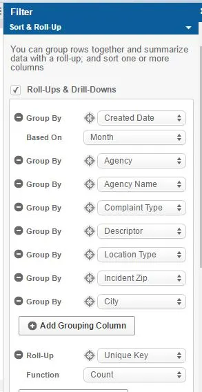
We then simply hit the “Apply” button, and download the resulting dataset. Thus, we have a nicely processed file at the month-agency-type-location-location type level, with a count of records for each. Beautiful.
The second part of preparing the data for FactorPrism is putting into an SQL database where FactorPrism can read it from. In this case, we are going to use Microsoft SQL Server. (Free versions of SQL Server can be obtained here; download either SQL Server Express or SQL Server Developer Edition. Also, download SQL Server Management Studio here.)
The import process into SQL Server can be a little tricky, so we wanted to walk you through it. To start, we open SQL Server Management Studio, and connect to our server (it should be the one pre-populated in the dialog box).
If we don’t already have a database created where want to place our file, we right-click on “Databases” in the Object Explorer window, and select “New Database”. In the next dialog, we specify a name for our database, and click “OK”.
Now we are ready to import our data. we right click our new database and select Tasks, and then the “Import Data” feature.
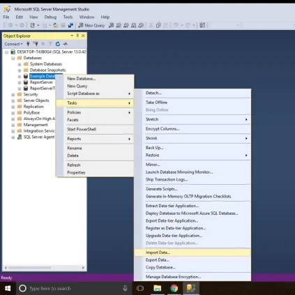
In this case, since we are importing from a CSV file, we select “Flat File Source”, and then find our CSV file in the resulting dialog box.
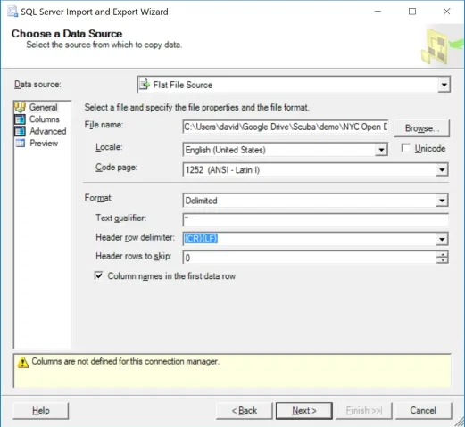
We also make sure we include double quotes – ” – as our “Text Qualifier”.
Now for the slightly tricky part. We now click “Advanced” on the left hand side, as we need to specify the types and lengths of our input data.
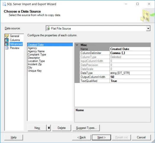
Here we have to specify our data types. One useful feature is using the “Suggest Types” button to get started – you can have it scan up to 1 million rows to guess what the fields are (keep in mind this might take a few minutes). I recommend 100,000 in this case. (Also suggest padding strings by 100%, to be safe). When we are done, we need to ensure it guessed the types correctly. Mainly, that “Created Date” is a DT_DATE datatypes, Agency through City are all DT_STR datatypes, and that Unique Key is a tw0-bit unsigned integer (DT_UI2).
We then select next, and select as our destination “SQL Server Native Client 11.0”, and specify our database where we want to import this table. We then select “Next”.
One more subtlety. On the next screen, select “Edit Mappings”, and make sure “Unique Key” is being imported as a “Float” (this is currently a requirement for FactorPrism, but will be relaxed in the next release).
We then can hit finish, and the data should import correctly! If it throws an error, it is most likely due to truncation errors. Delete the table it imported and try again, increasing the string field length (you can set them all at 200 just to be safe if you’d like).
Great! Now we have the data all downloaded and imported into our SQL Server. Now it is all ready for FactorPrism to find our answers. Sorry this was tedious, but the good news is it is by far the hardest part of the process. Finding our patterns is the easy part! More on that in the next and last post of this series.
Until then, Happy Factoring!
Now that we’ve downloaded our data and loaded into SQL Server in the previous post, we get to the fun part: running FactorPrism. In a few simple steps, we load the data into FactorPrism, select our time period of interest, and specify our field hierarchies. It will take you longer to read this than to actually do it, most likely.
After opening FactorPrism, we select the “Connect to Data Provider” button. We select “Microsoft SQL Server”, and then our server name, and press OK. We then select our database name and table name.
Finally, we need to select the date field and the data field. Our date field is “Created Date”, and our data field is “Unique Key” (since this field actually contains the count of Unique Keys). Also, we optionally add a data label, “# of Calls”. This is what our configuration looks like when complete:

We simply hit the “Load Data” button, and we are on to our date selection part.
As described in our first blog post of this series, we select the 9/1/2013 – 3/1/2017 portion to explore. We simply select this using the mouse.

The last bit of setup is simply describing what our hierarchies are – that is, what is the taxonomy of our data features. Simply put, we want to tell FactorPrism what types of fields we are interested in finding patterns over, and how those fields relate to others of the same type. For example, since (in NYC anyway), zips are a subset of cities, in our Location hierarchy, we list City first, then Incident Zip.
In our example, we have 4 types of hierarchies: Agency, Type (of Complaint), Location Type, and Location. This is what our hierarchies look like when filled out in FactorPrism:
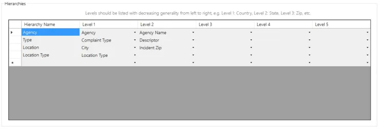
(This might seem a little complicated, but practically its very intuitive. For example, if this were retail data, our Product Hierarchy might have category, sub-category, product, and subproduct fields.)
That’s all! Now we just click the Execute button, and let FactorPrism do the rest! It really is as simple as that. You can view the results of this analysis in our first post.
We hope you enjoyed our series on mining the NYC 311 Dataset! We will be posting other similar examples very soon.
Stay tuned, and Happy Factoring!
– Dave
Besides uncovering latent sales patterns in retailer data and detecting call-center trend shifts, a major application of FactorPrism is to financial data, e.g. stock market data. Stock market data is a perfect fit for our software, as it
a) is time series
b) is transactional
c) is hierarchical, namely for equity categories
What exactly would we be looking to find? Well, we want to uncover below-surface patterns in stock categories. For example, even if overall technology stocks are trending upward at 5% YTD, do we see a YTD decline within a subspace of technology, like software?
To demonstrate a typical use case in mining equity prices, we pulled historical end-of-day (EOD) data for the NYSE for 2017 from a publicly available data source. Next, we merged in stock categorization and outstanding share information from NASDAQ here (and cleaned out any missing data).
To perform our analysis, we need to use market capitalizations as opposed to stock prices, since market caps are additive. In other words, the market cap of all stocks is equal to their sum; the same does not hold true for stock prices.
So we merged the two datasets together, and determine EOD market caps from prices, in one fell swoop in SQL Server like so:
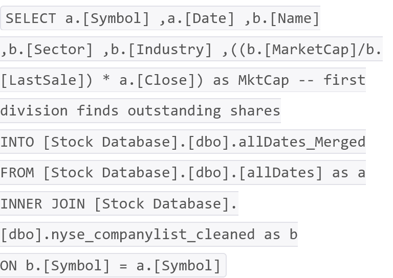
That’s it – we now have a flat file ready to be analyzed with FactorPrism.
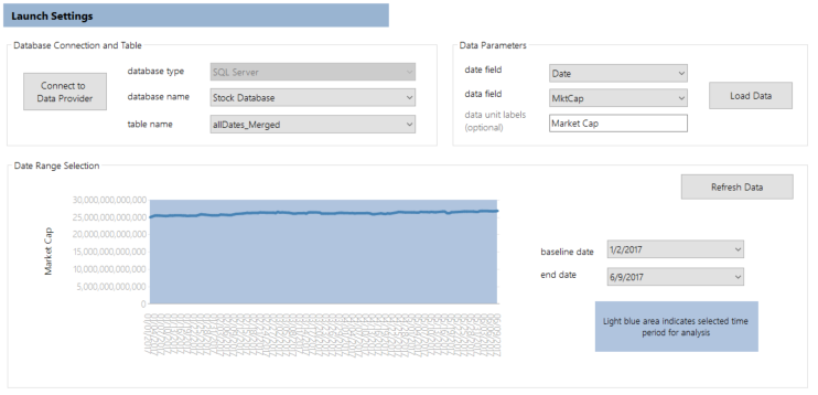
We set up FactorPrism very simply as below. Note we decided to mine over the entire time period, because FactorPrism will be able to analyze this data nearly instantaneously (so why not).
Next, we defined our feature hierarchies. In this case, we only have one hierarchy of features, which we called “Type” to be super-creative. Note we included both Symbol and Name, even though they are duplicative, just for readability sake in the results (it does not affect performance).
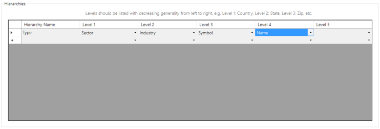
That’s all the setup there is. Since there is only one hierarchy, FactorPrism executed this analysis in just a few seconds.
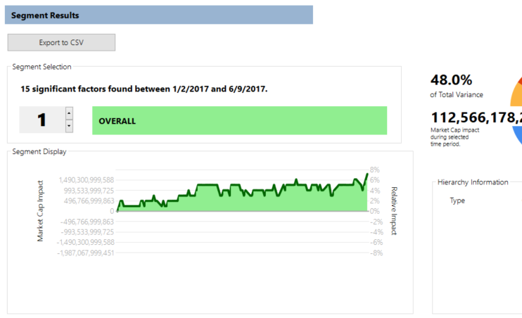
Not surprisingly, our biggest impact was due to the overall market trend (as shown in our overall factor), showing a significant upward movement in early 2017:
Not every category has had such a rosy year, however. When factoring out the overall upward trend, energy has seen its overall cap decline by a stark 14%:
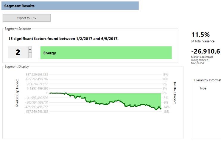
Note this decline would have been harder to see had FactorPrism not inherently teased out the upward Overall factor.
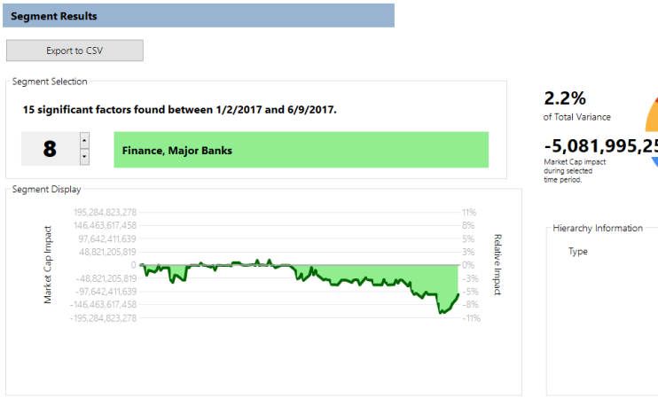
One set of factors is particularly interesting and demonstrates the teasing-out power of the software. We see a large decrease (3 to 5%) in the market capitalization of “Major Banks” (places like Citigroup and Capital One):
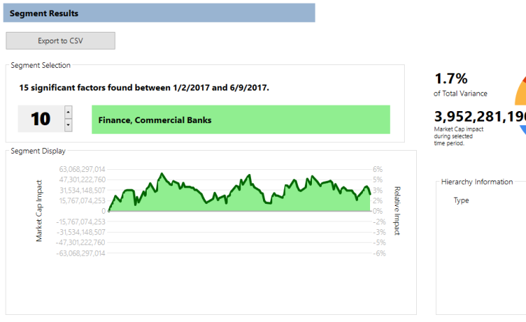
However, we see almost the same increase when we look at the behavior this year of “Commercial Banks” (places like Barclays PLC, RBS, and RBC):
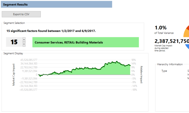
Finally, in what is surely good news, we see a pickup in a particular type of retail stock, that of building materials:
There are obviously a lot of trends (10, to be exact) that we haven’t explained here, many of which are super interesting and surprising, so we encourage you to download a free trial of FactorPrism and explore this dataset, and the rest of your transactional data, easily and automatically. Please let us know how it goes in the comments!
Happy Factoring!
P.S. Want a customized demo of FactorPrism on your organization’s data? Please contact us at info@factorprism.com and we’d be happy to discuss!
Today we are excited to announce our latest beta release of FactorPrism, with a lot of awesome new features to make using FactorPrism even easier!
Import directly from CSV/Text file – one of our most requested feature updates. Now, you no longer need SQL Server or MySQL databases to run FactorPrism (though if you already have them, that’s fine too!).
Time rollups directly in FactorPrism – now, if you have granular timestamps on transactions, no need to roll them up to days, weeks, or months outside FactorPrism – this is built right in with the new “Date Rollup” feature.
Bug fixes (thanks for all the feedback – keep it coming!!)
No need to download a separate license file for trial usage – it’s built right in!
There’s never been a better time to join the thousands of users saving countless hours using FactorPrism, so download it today! And if you like it, please tell your friends!
Happy Factoring!
To provide another use case tutorial for FactorPrism, in this post we’d like to walkthrough FactorPrism with pharmaceutical market data. Pharma data is perfectly suited for FactorPrism’s analysis: TRx (prescription) data typically has many dimensions like geography, payer, specialty, and product type, wherein trends may be found within any of these levels, or across them.
First and foremost, you need to download and install FactorPrism. (Also grab the latest PowerPoint template there if you don’t already have one). Email us for a trial license if you need one.
Before starting FactorPrism, we must prepare a dataset to analyze. FactorPrism ingests vertical files – that is, where each row represents a single data point. Moreover, the data should be rolled up to the level at the most granular level which you want to analyze. For example, in our simulated data, we have aggregated the data to the [Week-Area-Region-Channel-PBM] level, so that we can analyze it at this or any more aggregated level we wish. So in our example, we have the following fields in our dataset: [Week], [Area], [Region], [Channel], [PBM], and [TRx], where [TRx] is our summed measure variable, GROUPED BY the other columns. This is a snippet of the first few rows of the data we will be importing in this example:

Once we have prepared our dataset, we open FactorPrism and import it. In this example, we have saved our simulated pharma dataset in a CSV file, so we hit the “Import CSV or TXT” button and select the file. We then select our date field and data field, which in this case are “Week” and “TRx” respectively, and optionally give a data unit label which in this case is also “TRx”.
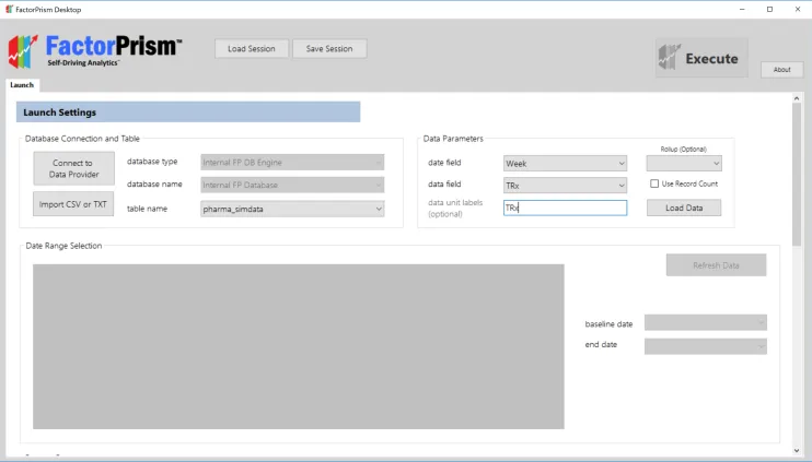
Next, we hit the “Load Data” button. In a moment, our overall data trend loads, and we select our desired time region to analyze.

The final step in our setup process is specifying our feature groups. We first give our groups labels, in this case “Payer” and “Geography”, and specify which fields are included in each. Notice that the fields must be specified in hierarchical order, largest to smallest from left to right – e.g., if Areas contain Regions, then [Area] is first, then [Region]. Likewise, since Channels contain PBMs, [Channel] is first, then [PBM].
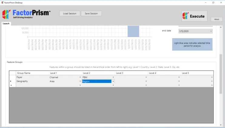
That’s all the setup there is! We then just hit the “Execute” button in the upper right hand corner of our screen, and let FactorPrism do the rest.
Once we’ve run FactorPrism, we are presented with the Results screen, as below.
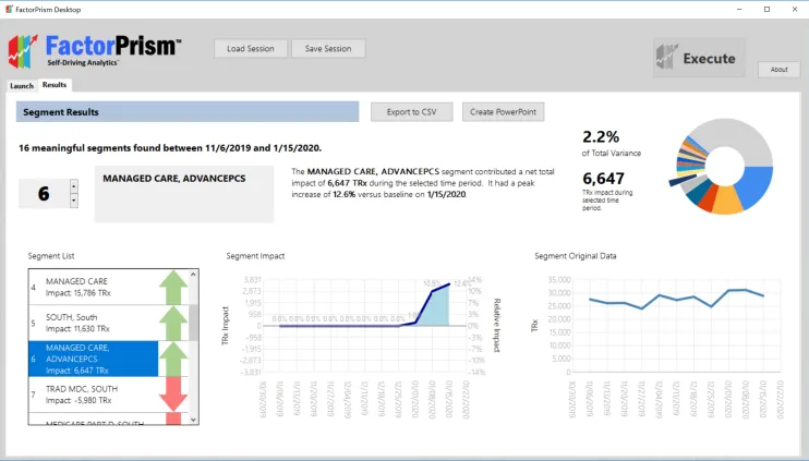
Let’s break this pane down. On the left, we see the list of our 16 most meaningful segments FactorPrism found during this time period. Note, although we refer to them as “segments”, they are not mutually exclusive – a record can be a member of several significant segments. In fact, all records are part of the “Overall” segment, which is usually the most meaningful. The “Overall” segment includes any seasonality seen over all the records, as well as any trend seen throughout all the records.
The great part about FactorPrism is that it separates out the impacts when there are several significant effects. For example, in the segment highlighted above, [Managed Care – AdvancePCS], we see in the raw data – the graph to the far right – that there was a fair bit of volatility in this time period. However, when other effects are isolated out – e.g. the Overall seasonality and trend are removed – we see a clear rise at the beginning of 2020 – shown in the “Segment Impact” graph in the middle. This impact is specified as a percentage – 12.6% at maximum. What this means is that any record part of [Managed Care – AdvancePCS] is given an average 12.6% boost by being a member of that segment (in addition to any increases/declines contributed by other segments it may be a part of).
On the top right, we can see that the contribution of this effect within [Managed Care – AdvancePCS] is estimated to be 6,647 TRx during that time period, which accounts for about 2.2% of all the impacts FactorPrism found during this period, making it the 6th most important contributor.
Note on this page we can select to export our results as a raw CSV file, or connect to the freely provided PowerPoint templates and export our results as a fully formatted PowerPoint.
That’s all there is to it! It really is that easy to find the most meaningful trends in your data using FactorPrism.
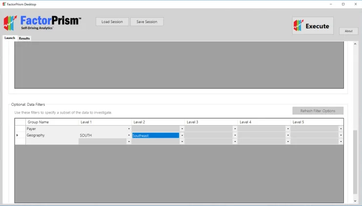
One quick thing: FactorPrism has a very useful optional feature of filtering down to a lower level before running the analysis (so you don’t have to filter the dataset beforehand). This is found in the table below our Feature Groups. We first hit the “Refresh Filters” button, and then specify any filters we want. For example, if we were only interested in what was driving performance in the “Southeast” territory, we could filter as below:
We are confident FactorPrism will save you loads of time in finding the most meaningful trends in your data. Let us know how it goes, and Happy Factoring!
We are excited to announce the release of the FactorPrism academic background paper, detailing the use of the novel basis pursuit algorithmic backend. Find the paper at this link – and please share your feedback!